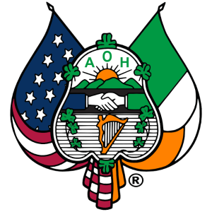
Logo
The emblem of the Ancient Order of Hibernians in American is as pictured above with the crossed flags of Ireland and America behind it. The flags are not part of the emblem, since they are already symbols of another entity. Prior to 1937, when the tricolor of Ireland was adopted, Ireland was represented by the flag of the United Irishman, adopted in 1798, showing a gold harp displayed on a field of green.
The artist who conceived the original emblem of the Order is unknown, but his choice of layout and devices are, in many cases, unmistakably evident. The emblem is a shield, horizontally divided into three fields, with the significance of three relating to many Irish tenets from the mystical appeals of that number in Celtic mythology to the Holy Trinity itself.
The top field of the emblem depicts the sun rising over a new Ireland, a device not uncommon to Irish and American crests, shields and newspapers logos. The appearance of the initials A.O.H. in the glow of that sunrise indicates that the A.O.H. is a part of that new dawn.
The center field shows another common device of two hands clasped in friendship denoting Hands across the Sea, and representing the original links between the A.O.H. in Ireland and the A.O.H. in America. The proper display of this device is a blue sleeve extending from the left (America) and a green sleeve extending from the right (Ireland). The left and right positions correspond to the geographic east-west relations of the two nations.
The lower field contains a harp flanked by shamrocks. The harp is the official emblem of Ireland, and as such should be the Brian Boru harp. However the harp of the Irish Brigade of France, with the figure of a woman in front, is often used to represent the Wild Geese. The number of shamrocks flanking the harp varies, and while 16 per side would be valid representation of Ireland’s 32 counties, it is not always possible to depict that many. The significance of the shamrock is obvious.
Four shamrock’s also adorn the outer edges of the shield to represent the four provinces of Ireland. Some presentations show the lower shamrock inverted. Since an inverted device indicated trouble, this has been explained as representing Ulster, but given the age of the emblem it is more likely that it was simply presented that way so all the stems would connect to the shield.
Altering Our Logo
Our log should not be altered. State, County and Division boards may however incorporate the logo into their own unique logo. In no case should you remove or cover parts of the logo and all the elements of our logo should be fully present in the final image.
Licensing
Please note that the AOH logo is a registered trademark, and its use is reserved for official purposes by the Ancient Order of Hibernians in America. For information on licensing, please refer to our AOH Licensing Agreement.
Colors
The colors of our logo are the colors from the Flags of the United States of America and Ireland.
| Color | Color Code | |
|---|---|---|
| Old Glory Red | #b31942 | |
| White | #ffffff | |
| Old Glory Blue | #0a3161 | |
| Green | #009a44 | |
| Orange | #ff8200 | |
| Black | #000000 |
Font
Times New RomanThe official font for the Ancient Order of Hibernians is Times New Roman. This font should be used when displaying the name of our organization. If the name is part of the text in a document, you may use the default font type. In all cases, the font for our name should remain Times New Roman and should not be changed to a different font type.
Name
“The Ancient Order of Hibernians in America”.
Our full name is “The Ancient Order of Hibernians in America.” All logos and correspondence should include “The,” and the first letter of each word should be capitalized, except for “of.” The first reference to our organization in articles and documents should use our full name: The Ancient Order of Hibernians in America (AOH). Subsequent references can use “The Ancient Order of Hibernians” or “the AOH.”
Tag Line
Irish • Catholic • American
When appropriate, our tagline should be included with our logo and name. This tagline succinctly describes our organization. It should be placed directly below our name or used as the footer to end a document or page.
